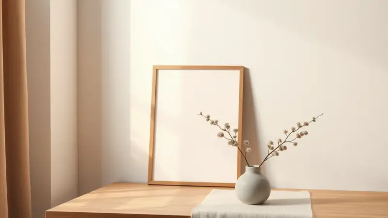
Luckiest People Alive Printable: A Simple 8×10 Wall Print
A short, happy phrase in big, bold letters, set on a clean background and slipped into an 8×10 frame: that is the Luckiest People Alive print. It says “we are the luckiest people alive” in a way that reads as a quiet reminder instead of a holiday decoration.
The design suits the stretch after Valentine’s Day, when the hearts come down but you still want something sweet on the wall. It also works well beyond February, because nothing in it is tied to one season.
The design: wording, colors and layout
The idea is to keep it simple. The phrase is the whole design, so the lettering does the work. Here is a layout that holds together well:
- Wording: “Luckiest People Alive” is the heart of the print. You can set the whole phrase on one line or break it across three lines, one word or pair of words per line.
- Colors: Choose two colors, one for the background and one for the lettering. High contrast, such as deep navy on cream or white on a soft coral, keeps the words easy to read from across a room.
- Lettering: Mix one bold, chunky font with one lighter script or thin sans-serif. Put the emphasis on “Luckiest” and keep the other words smaller.
- Margins: Leave at least half an inch of empty space on every side so a frame or mat does not crowd the words.
Because the print is meant to last, pick colors that match what is already in the room. If your decor leans toward two shades you love, use those, and the piece can stay up all year.
How to make your own
- Open any design app or word processor and set the page size to 8 by 10 inches, in portrait orientation.
- Fill the background with your first color, or leave it white if you prefer to print on colored cardstock.
- Type the phrase and choose your fonts. Test the arrangement by stepping back from the screen; if you can read it at a glance, it is ready.
- Print on heavy matte paper or lightweight cardstock. Thicker paper hides frame glare and keeps the color looking rich.
- If your printer does not print to the edge, trim the sheet to size with a paper cutter, or use a mat with an opening that hides the plain border.
- Slide the print into the frame and check that it sits flat against the backing.
If you would rather work by hand, pencil the letters lightly first, then trace them with a brush pen or a thick marker. Hand lettering gives the piece a cozy, personal look.
Ways to use it
An 8×10 print is easy to place. Try one of these spots:
- On an entryway shelf, leaning against the wall next to a small plant.
- Over a bed or a desk as a simple everyday reminder.
- In a gallery wall mixed with family photos, where the bold type adds contrast.
- Wrapped as a gift for newlyweds, a new home, or an anniversary.
A smaller 5×7 version of the same layout works well for a mantel, a nightstand or a bookshelf. Scale the design down, keep the same margins, and the proportions will hold. Making both sizes lets you hang a larger print in one room and a smaller one in another with a matching look.
If you swap the print with the seasons, change just the background color. A soft pink fits late winter, light green suits spring, and a deeper tone looks right in autumn, all with the same words.
Keep your finished print for personal use in your own home. If you share your own design, make sure the lettering and any artwork in it are yours or free for the use you have in mind.