Fall Prints in Green Plaid and Blue Floral: The For Each New Morning Print
This fall print comes in two color schemes: a cozy green plaid and a brighter blue floral. Both carry a thankful message about welcoming each new morning, and both are meant to hang on a wall or mantel from the first cool days of autumn until it is time to switch to Christmas decor.
Below are the answers to the questions people ask most about making and displaying a print like this.
What does the print look like?
The design is simple: one centered message on a patterned background, with a clean border so it looks finished in a frame. Keep the wording short, a single gratitude line about each new morning, with a smaller line beneath it if you like.
Green plaid: This version has a deep green plaid background and a soft cream panel in the middle for the lettering. It looks rustic and homey, and it suits wood tones, flannel and pumpkins.
Blue floral: This version has a brighter look. Use a blue floral pattern with a pale panel behind the words. It still reads as fall when you pair it with warm accents like rust, mustard or copper.
How do you make your own?
You can use any design app or word processor that lets you set a background and layer text over it. You will need:
- A plaid or floral digital pattern in your chosen colors, or a patterned paper you can scan
- Two fonts: one script for the main line and one plain serif or sans-serif for any small text
- Matte or lightly textured cardstock
- A frame in a standard size such as 8 x 10 inches
- Set your page to the size of your frame, or one size larger if you want room to trim.
- Fill the whole page with the pattern.
- Add a rectangle in cream or white at about 85 percent opacity, leaving an even margin of pattern around it. The panel keeps the words easy to read.
- Type the message in the script font in a dark color that contrasts with the panel, such as deep forest green for the plaid or navy for the floral.
- Add a thin line border inside the panel to frame the lettering.
- Print a test page on plain paper first and check the spelling, spacing and margins. Then print on cardstock.
- Trim any excess with a paper trimmer and slide the print into the frame.
Which color should you choose?
Choose the one that fits the room you are decorating. Green plaid blends in with traditional or farmhouse spaces. It also hides small printing flaws well because the pattern is busy. Blue floral works well in a space that feels bright or cottage-like, or if you want a fall accent that does not rely on orange.
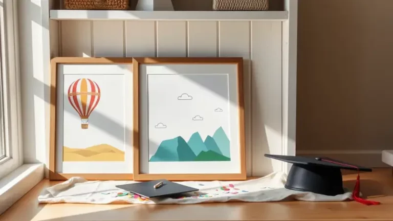
If you cannot decide, print both. Two frames side by side on a shelf look intentional, especially when one is propped slightly in front of the other.
Where does it look best?
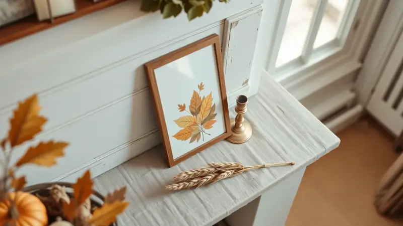
A print like this is low-maintenance decor. Try it on a mantel, a console table, a kitchen shelf or beside the coffee maker, where the “new morning” message fits naturally. Lean it against the wall with a small pumpkin or a jar of dried leaves next to it, or hang it in a grouping with other frames.
Because the message is about gratitude and not tied to a single holiday, it works from early autumn through Thanksgiving. Once the pumpkins go away, you can swap the accessories and keep the print up until December.
How do you keep it looking good?
- Print with the printer set to its best quality setting so the plaid lines stay crisp.
- Keep the print out of direct sunlight, which can fade inks over a season.
- Use a mat if the pattern looks too heavy right up against the frame edge.
- Store spare prints flat in a folder so they are ready for next fall.